
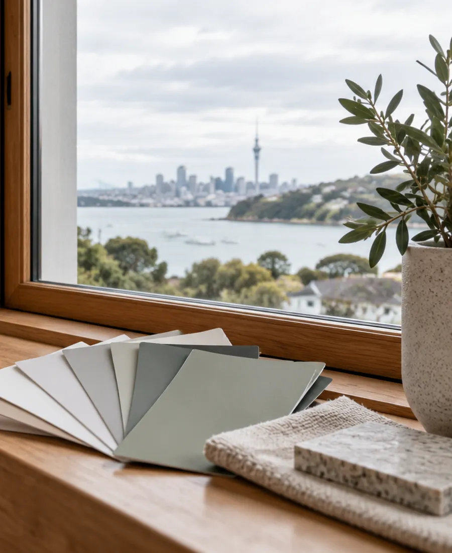
Paint a board, not a thumbnail
A small chip tells you little. A sample painted on a board or a patch of wall, big enough to step back from, shows how the colour behaves once it fills your view.
Auckland Roof Painting Pros
Thoughtful preparation. A considered finish. Start with a conversation about your property.
Start with the surface
Our Auckland Colour Consultation service starts with the property and the surfaces involved. For colour consultation, the important considerations include existing roof colours, daylight and fixed building materials. Understanding the existing material, coating and condition helps define the right preparation before a finish is selected. Tell us about visible wear, previous work and any areas that need particular attention.
A useful proposal should set out the surfaces included, preparation, any agreed repairs, the coating system and access arrangements. Timing also needs to allow for suitable application and drying conditions. Share your address, photographs and preferred timing through the enquiry form, or call to discuss the project. We can then clarify the details that need assessment and the next step for your property.
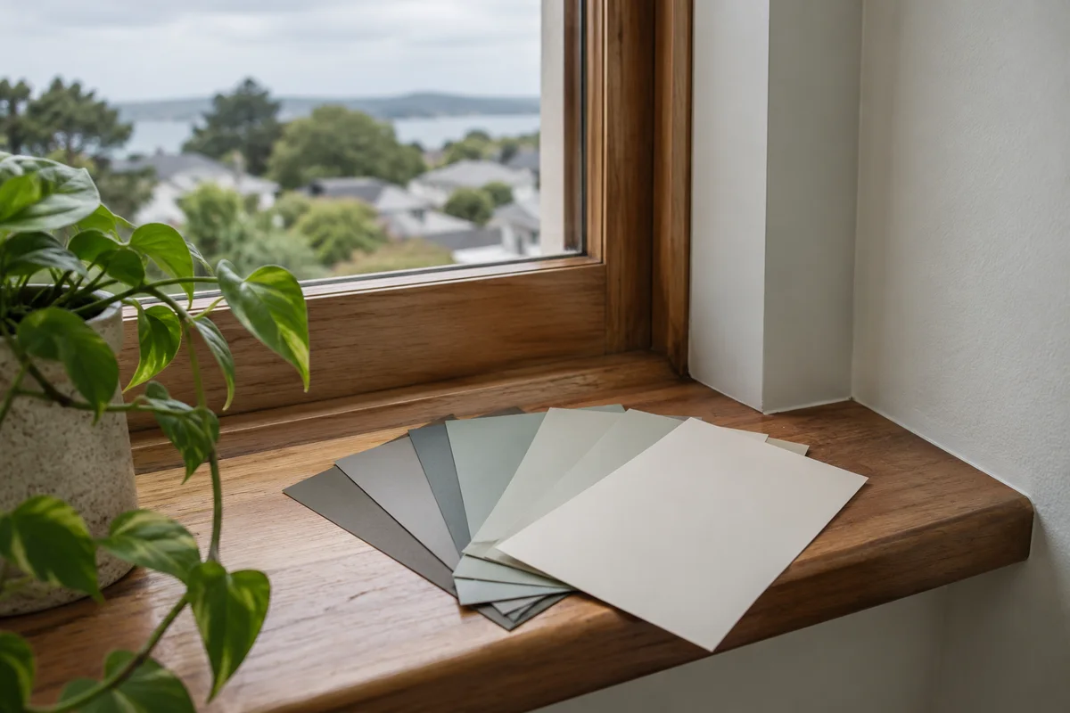
Colour doubts
The questions owners raise most often once the first shortlist is down to a few colours.
No. It has to sit comfortably with it. Look at the roof's undertone, warm or cool, and hold wall samples against it from the ground. An exact match is rare. A calm relationship between roof, walls and joinery is the usual aim.
Shared buildings and some properties have approval requirements. Check them before any paint is ordered, find out who signs off the choice, and keep that approval with the colour schedule so the painting brief matches what was agreed.
You can, but paint that has weathered on the other walls seldom matches a fresh coat of the same colour. The repaint may need to run to a natural break, such as a corner, or across the whole face to look even. Talk it through before settling on a partial job.
It can. Going from a strong colour to a pale one, or the reverse, may change the preparation and how many coats are needed. Tell us the current colour and the one you want so the scope reflects it, and ask for that in writing.
After the palette
A colour scheme only works once it is tied to real surfaces and coatings. These pages cover what comes next.
Each chosen colour still needs a primer, topcoat and sheen that suit the surface it is going on.
A new roof colour sets the tone for every wall and trim colour that follows.
Walls, fascia and joinery are judged together from the street, so they are best chosen together.
Room colours shift under lamps and ceiling lights, and beside floors and joinery.
Shared buildings often need an approved colour scheme before any paint is ordered.
Colour schedule
A schedule turns a palette into instructions. Every surface gets a line, so nobody paints the fascia in the wall colour by mistake.
| Aspect | What is recorded | Why it helps |
|---|---|---|
| Roof | Colour name and code, sheen and the coating system | It sets the tone every other colour is judged against |
| Walls | Colour name and code, sheen, and which faces or storeys | It stops two similar shades being mixed up on site |
| Fascia, gutters and downpipes | Colour and sheen for each, noted separately | They bridge roof and wall, so they are easy to get wrong |
| Joinery and doors | Colour, sheen and whether frames and sashes match | Windows and doors are close up, where small differences show |
| Sample approval | Who approved which sample area, and when | It gives you a reference to check against at handover |
Photograph first
Pictures taken safely from the ground give a colour conversation something concrete to work from.
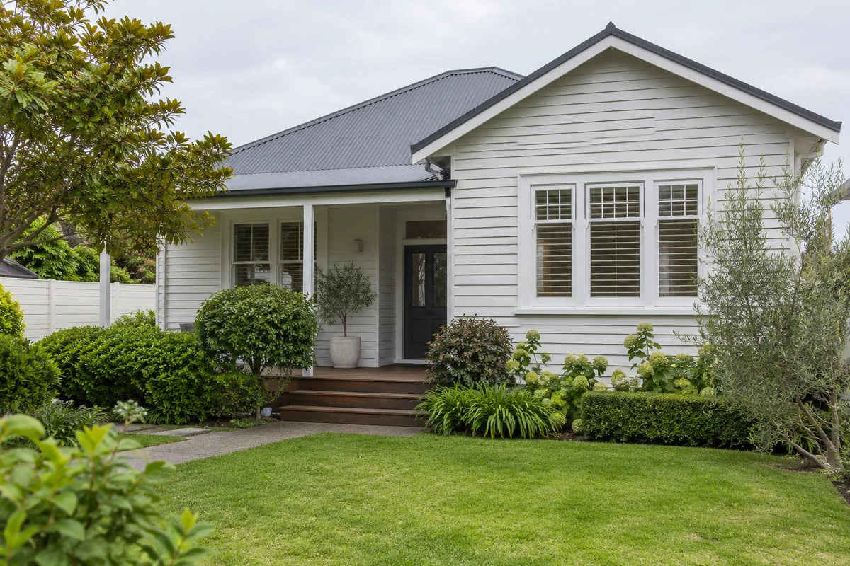
The whole house from the street, roof included
Doors and joinery close up, beside what surrounds them
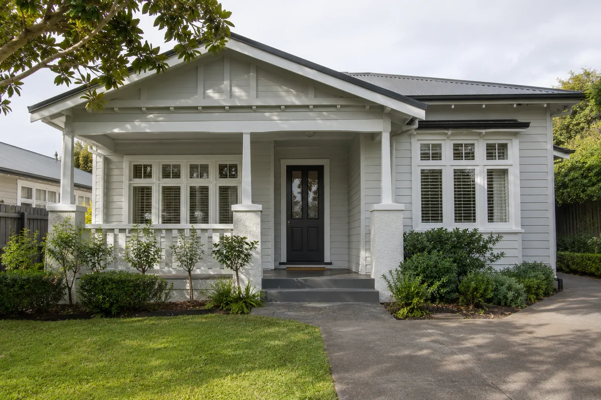
The sunny side and the shaded side of the building
Any colour charts or old samples you already hold
Sample testing
A small chip tells you little. A sample painted on a board or a patch of wall, big enough to step back from, shows how the colour behaves once it fills your view.
Hold the board against the sunny side, the shaded side and the entry. The same colour can read warmer in one spot and cooler in another, and you are choosing for the whole building.
Check it in the morning, at midday and late in the day, and under lamps at night for an interior sample. Leave it up for several days so one cloudy afternoon does not decide for you.
Stand the board against the roofline, window frames and paving rather than on a bare wall. Colours judge each other, and the comparison that matters is with what is staying.
Roof-to-wall edge
The strip between roof and wall is where colour choices collide. Each part of it reads differently.
The fascia is the line the eye follows between roof and wall. Painting it toward the roof colour tends to deepen the roof edge. Painting it toward the wall or trim colour tends to lighten it. Decide on purpose, not by default.
Gutters sit right at the edge, so their colour is easy to see from the street. Matching them to the roof or fascia keeps the edge quiet. A contrast colour turns the gutter into a feature.
A downpipe runs down the wall, so it can take the wall colour and fade from view, or the trim colour and read as a deliberate line. Try both beside a sample before deciding.
Soffits are viewed from underneath, usually in shade. A paler colour can look lighter under the eaves, while a deep one can look heavy. Check the sample from where you will stand, looking up.
Colour brief
Tell us about the roof, the joinery and any colours you are already weighing up. We can talk through how they work together and what the schedule should list before the work is quoted.